With the help of a data set, different information levels are to be generated. The following work, was restricted by guidelines. Only color, shape, the arrangement and the animation or transition of the visualized data, was allowed to transport
information.
My data set is about the players of the NBA (National Basketball Association). It shows from which college the players came into the league.
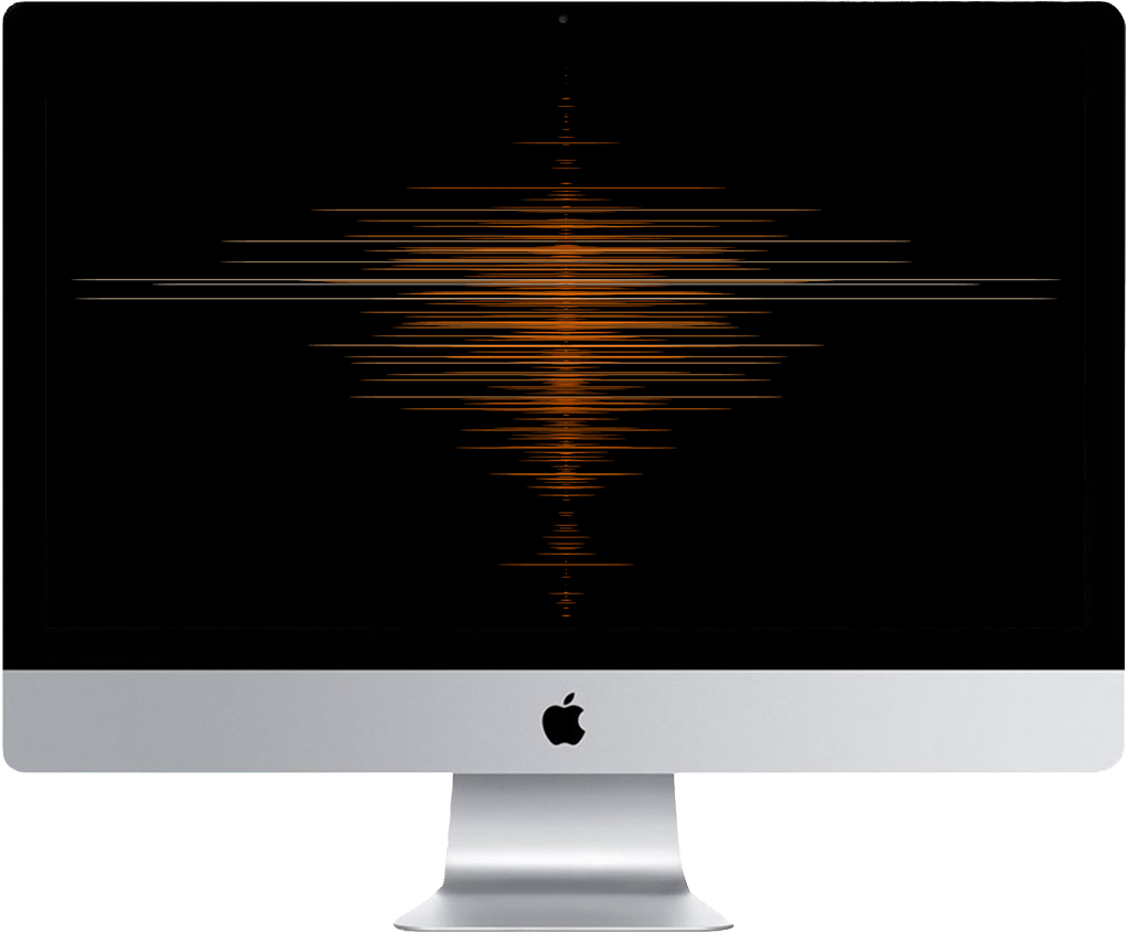
The final outcome consists of four static screens and the transitions inbetween them. The screens are explained first, followed by an operating video, which shows the transitions better.

It shows colleges in the USA with students who played in the NBA after their studies.

The opacity is not by 100%, which results in a heatmap. I want to show which college had its heyday in which year or decade.
It shows the total time of a college in the NBA (as in level 2), but in this depiction it is even better for comparing the stroke lengths with each other.
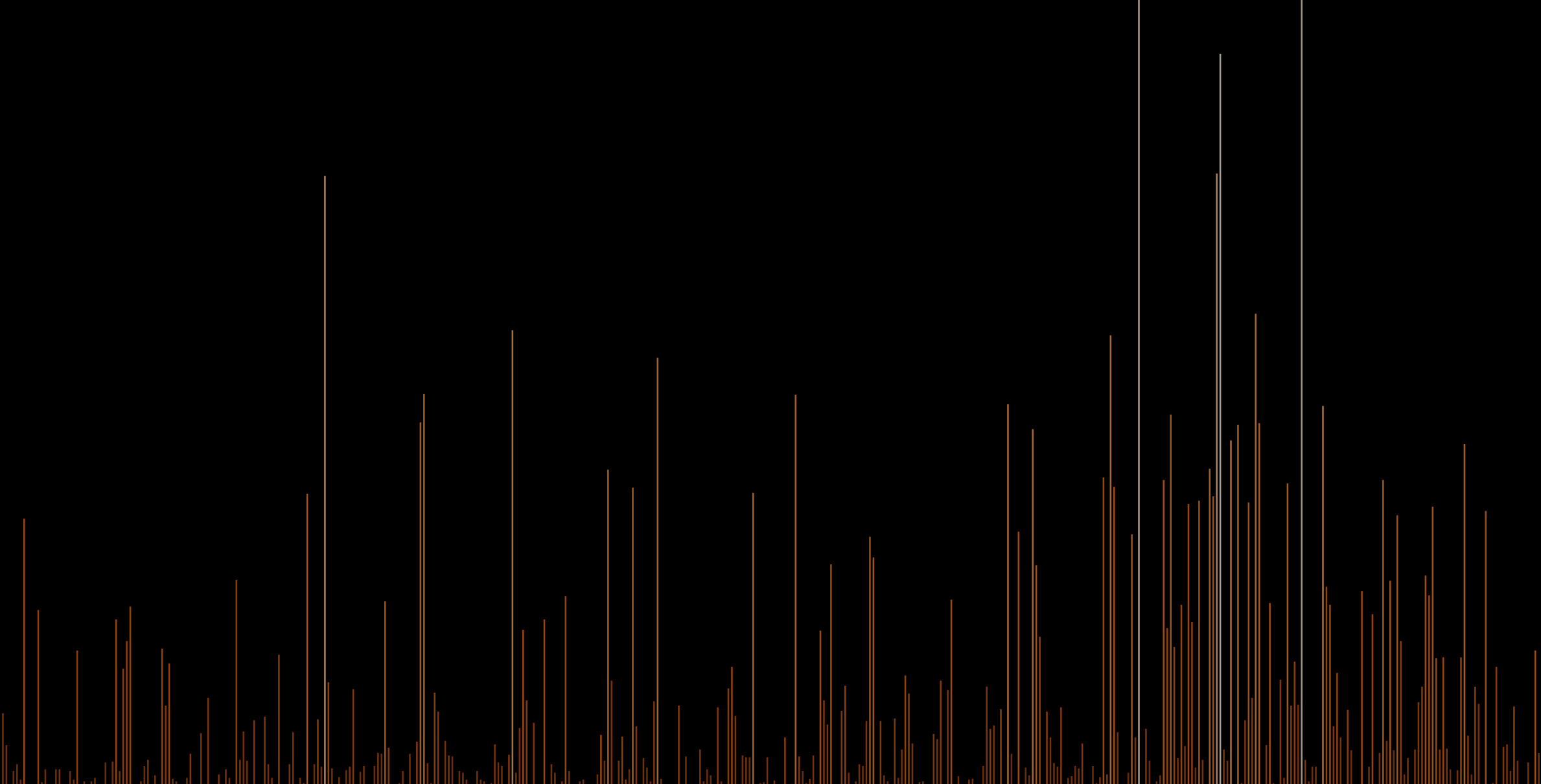
Each player is indicated by a dot. Brighter points are a sign that several players came into the league this year. You can see phases with more or less player growth for the league.

It shows how the interaction with the data looks like.
One can also interact with the data by yourself. Simply
click here
and a new tab which shows the data appears.
I did that project on my own with the help of my supervisors. It took part in the 2nd Semester of my studies. The course is called "Programmed Design"
solo project
Prof. Hartmut Bohnacker
Fabian Rauch
I used Atom as editor and I programmed it with the common web languages HTML, CSS and JS
I put my priority on the implementation because I was focused on understanding the programming better. I succeeded in this intention. The design suffered, which is certainly improvable in this project, because it wasn't the main focus.