Space Race
Project 1
Space Race
Project 1
Our goal was to create an interactive communication system, such as those found in museums.
Knowledge transfer is always one of the primary targets in such projects, but before you get there, you have to make the user curious. Therefore, our
main focus was to open the door and make our application looks attractive for a younger audience.
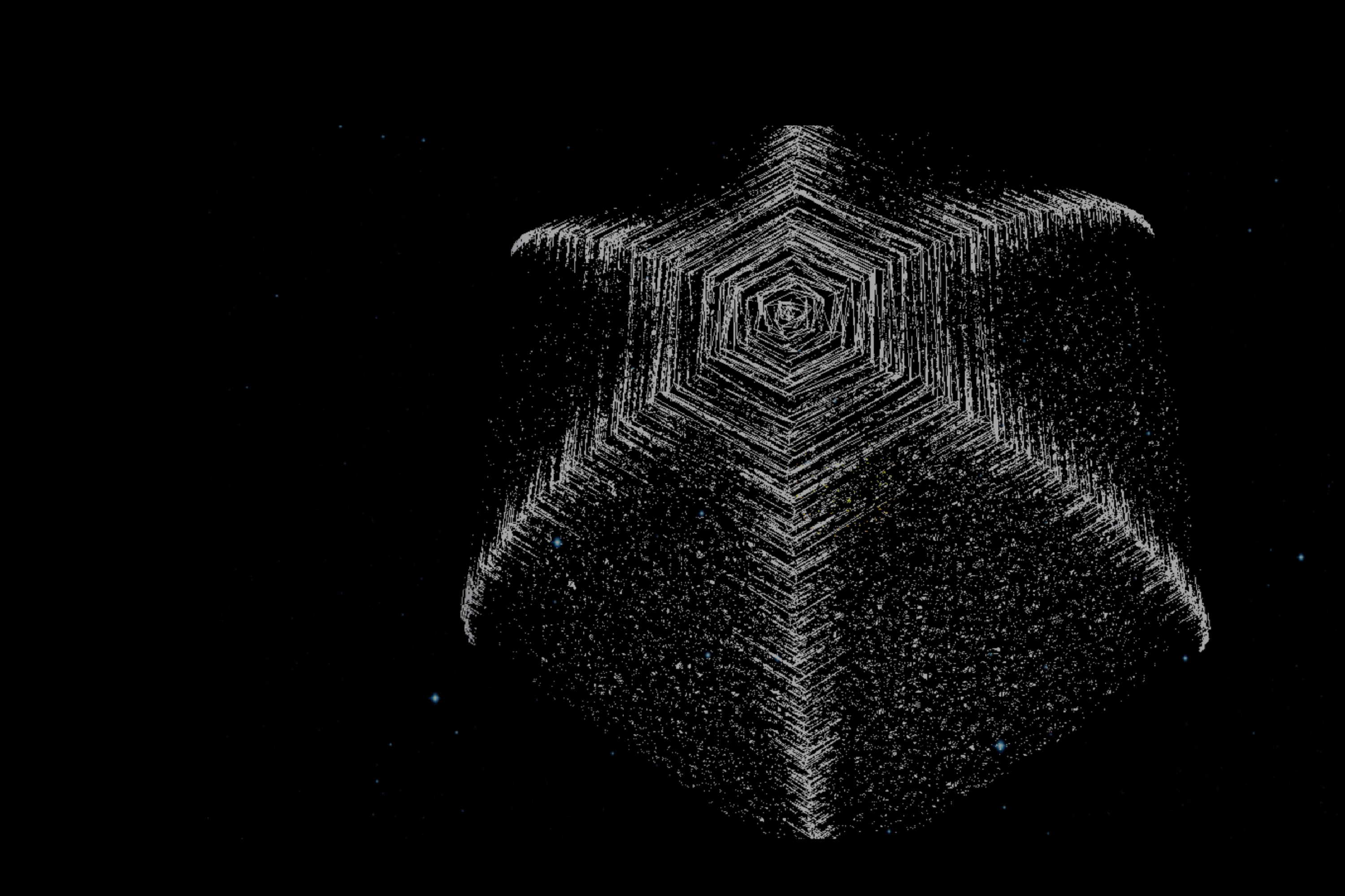
The idea was to generate the feeling of flying through space while discovering information. The design of a long mono-screen, which can be explored with a rocket, is the approach. The following draft of the mono-screen should help to get the idea.
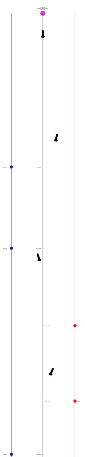
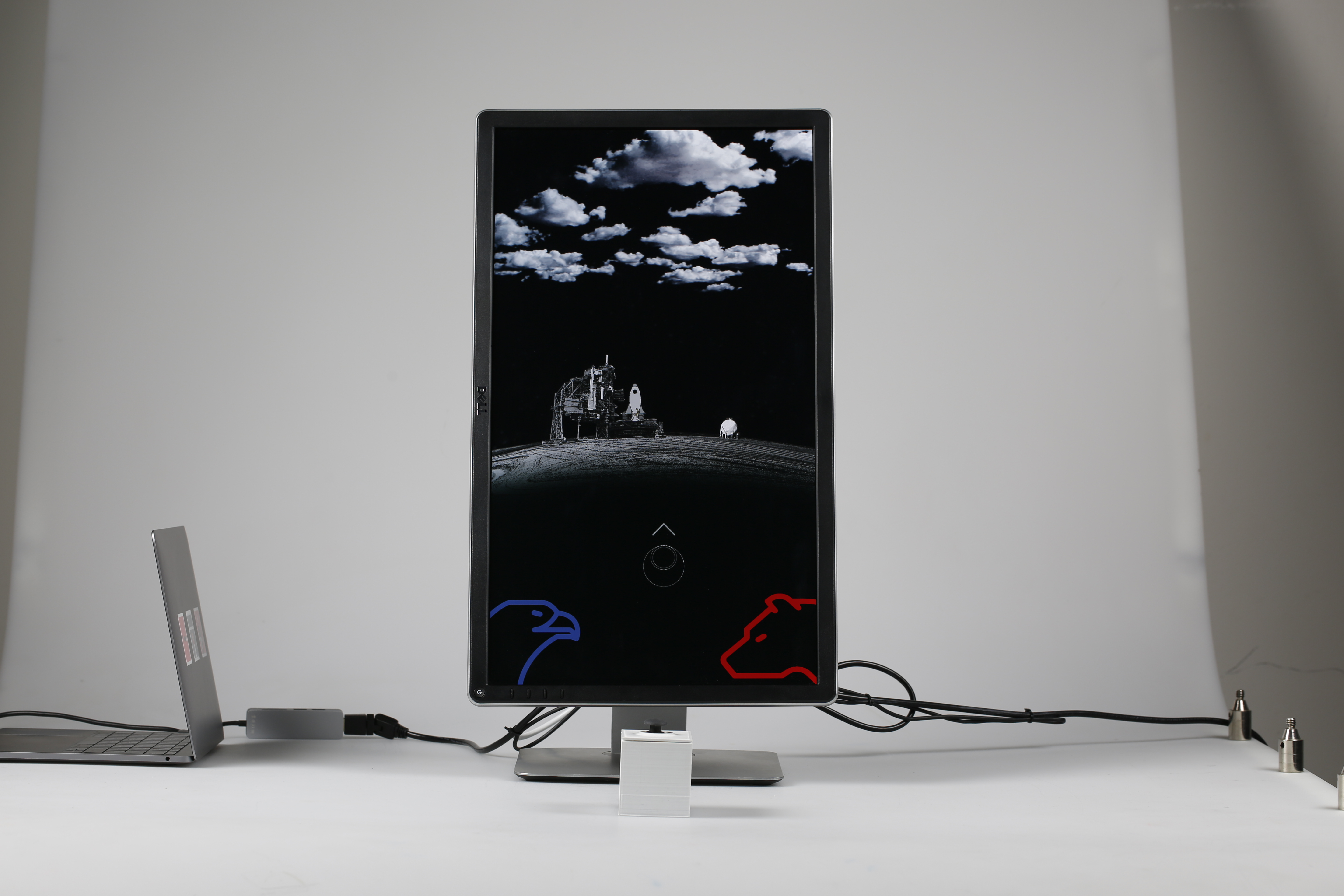
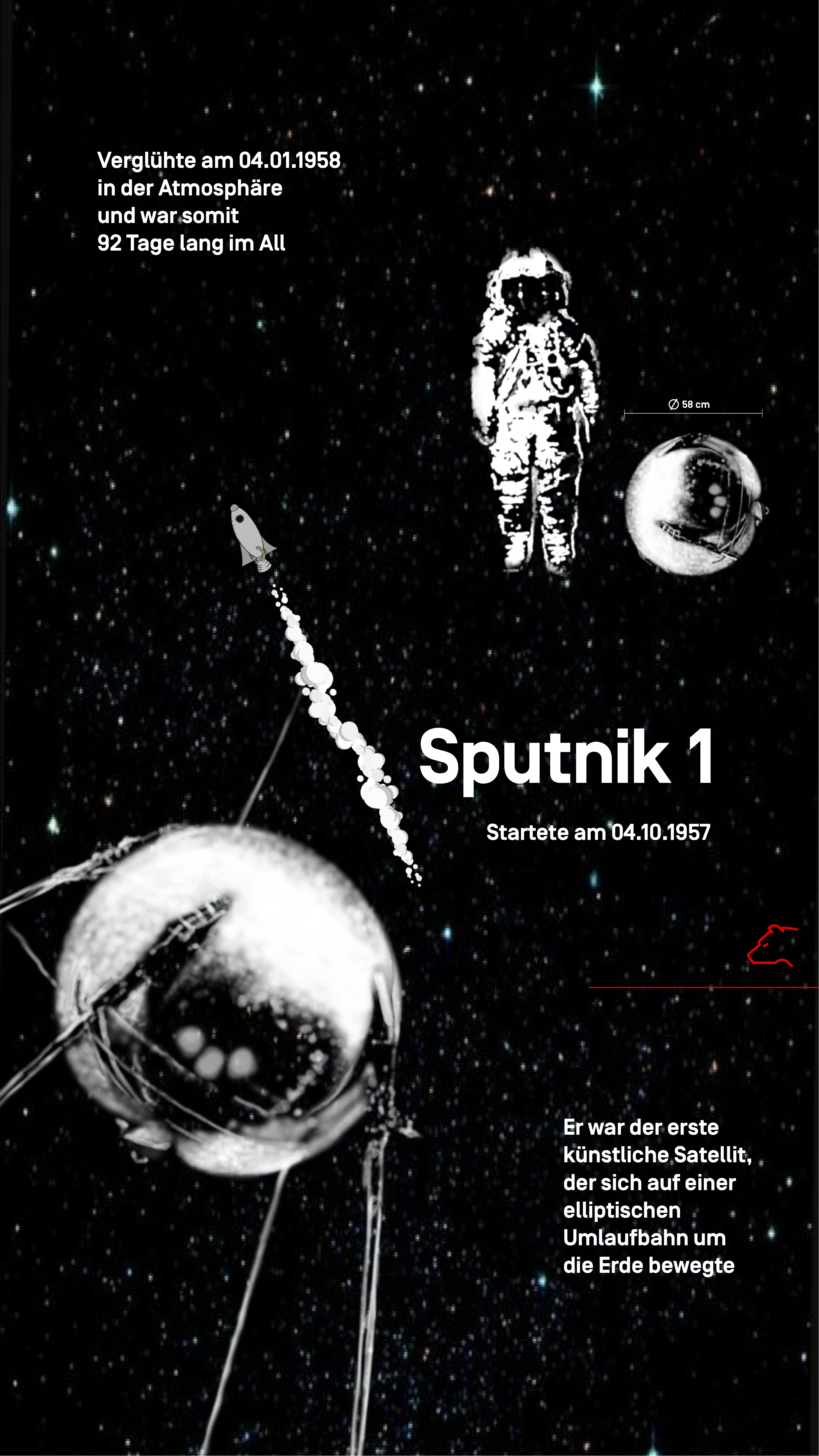
At the top, the pink dot, is the
first space mission, in which the Sowjets and the Americans worked together. This marks both, the end of the space race and of our freely operable space.
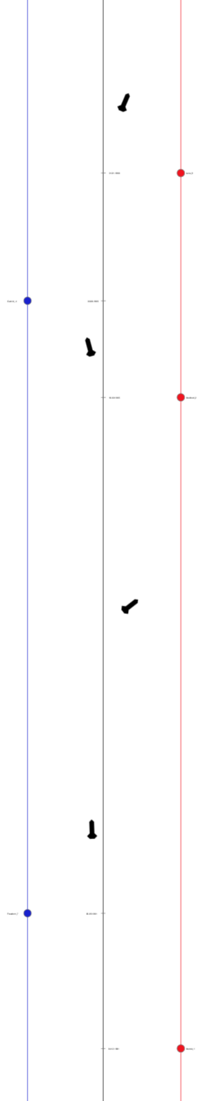
While flying up, you can discover crucial moments in the US and the Sowjet Unions space history.
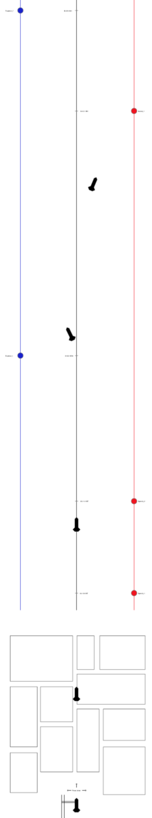
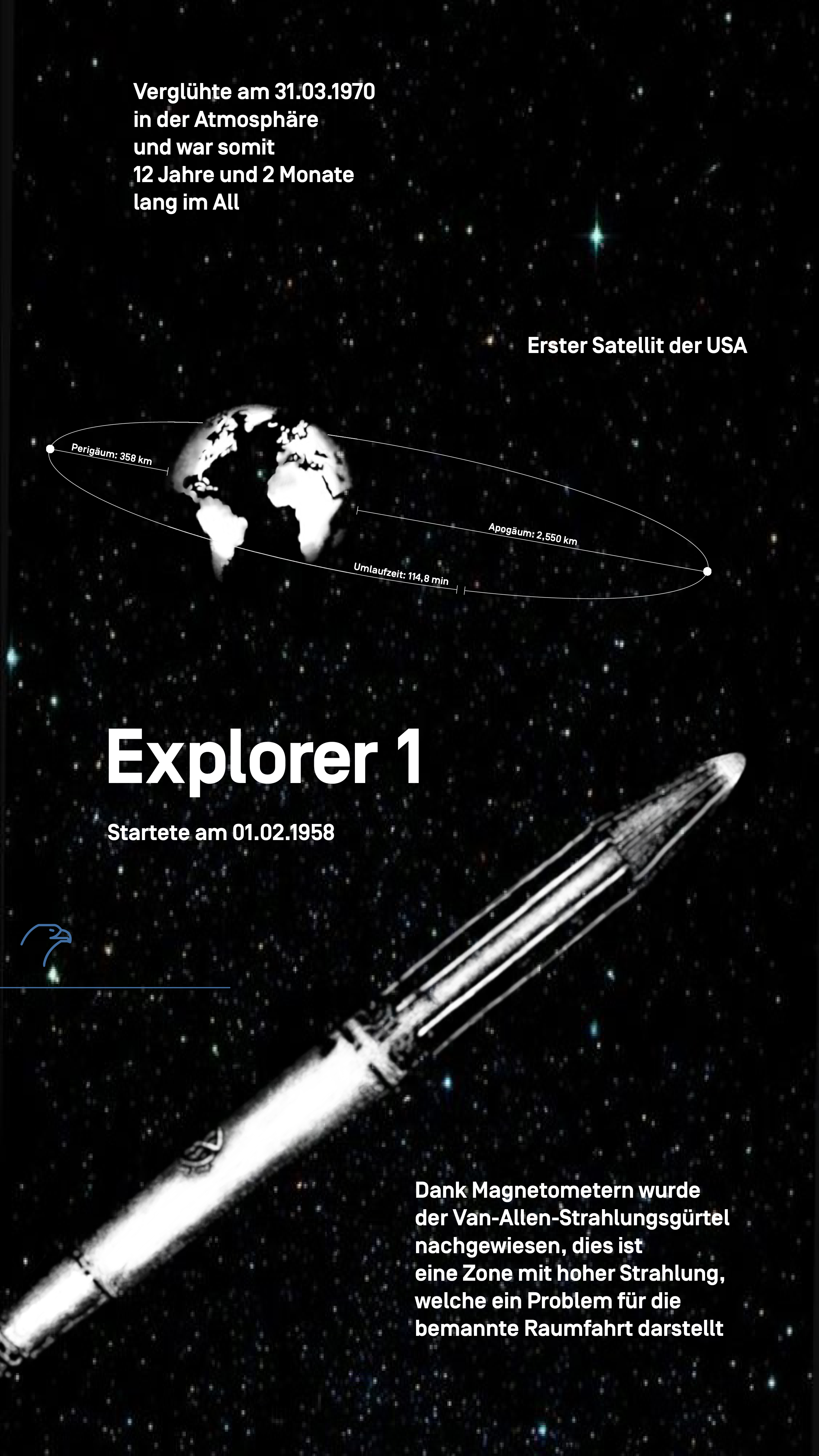
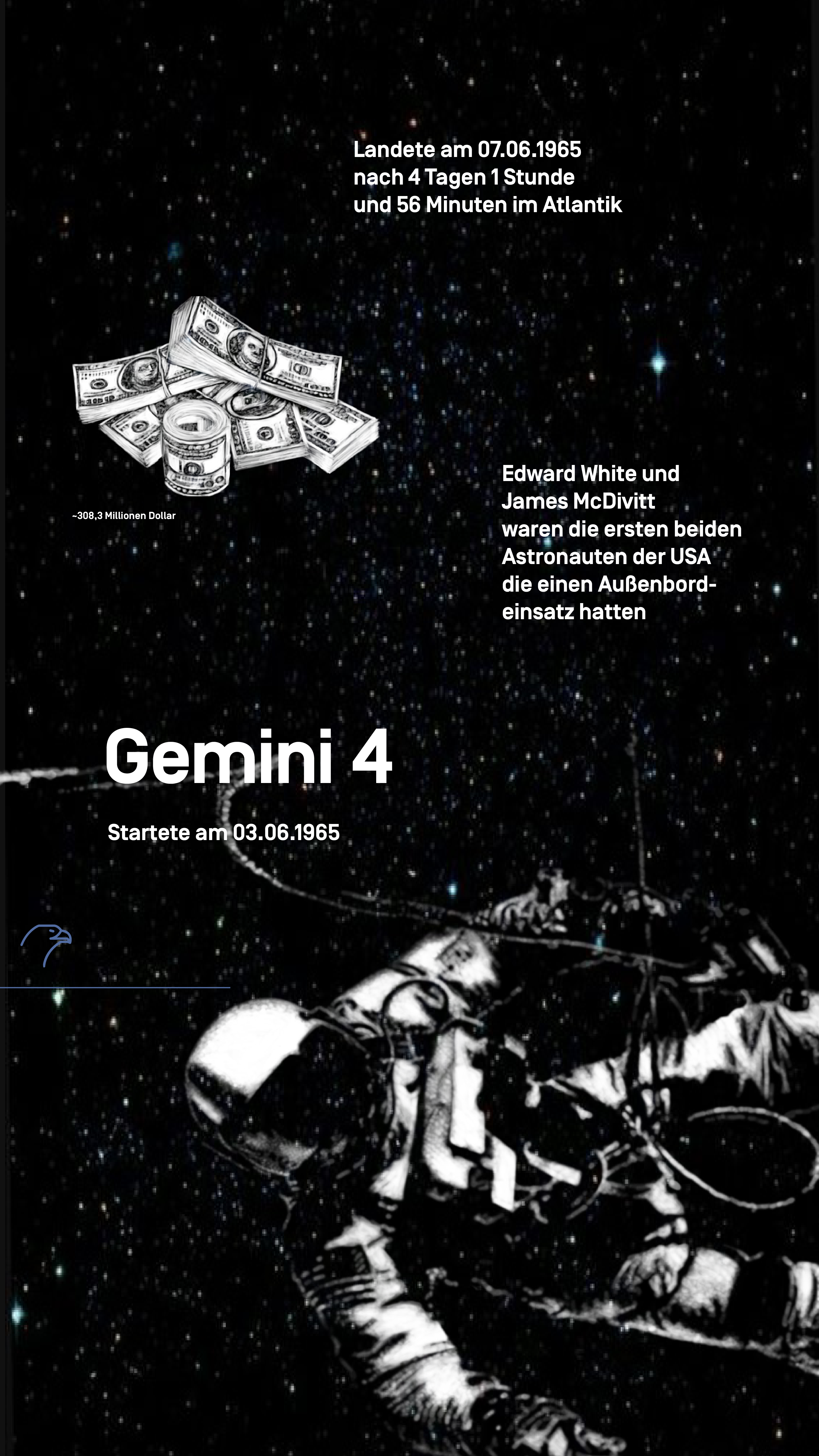
Each of the dots, are representing milestones.
Red dots representing the Sowjet Union, and ...
... blue dots the USA.
The black Illustration symbols the avatar, the rocket, with which one can fly independently through space.
The missions follow the timeline. The ones you encounter
first on your flight also took place earlier in time.
Marked as rectangles, the first part of the journey are the instructions, how to navigate the rocket for instance, and some information about how the space race started.
You start the journey from the bottom, from the launching plattform.
A game like interface equipped with an avatar, the grey rocket, to fly in all directions.
On the small picture you see the interaction with the controller.
In order to make the interaction realistic, we programmed gravity into it. The slight attraction down can only be avoided when you land the rocket.
The red bear represents Russian space missions.
The screens are all similar built up, this guides the view and makes it easier to perceive and find the information.
High quality illustrations extend the interaction time and spark enthusiasm. Pictorial and clear data graphics ensure a fast optical capture and processing of the information. Short line text invites more to read.
The blue eagle represents the US space missions.
It shows how the interaction with the communication system looks like.
The Project was created in 2019 and the duration was one semester. We mainly seperated the work in three parts.
The illustrations, the concept including layout and data graphics, and the development in unity.
Unity, Adobe (Illustrator, InDesign), Procreate
My main tasks were placed in conception and the elaboration. I kept myself busy with the appearance, the guided view, layout, typography and data graphics.